Exploring Data with Streamlit in Python
Discover how to use Streamlit to create interactive web applications for data analysis and visualization, showcasing data exploration through maps and statistics.
7 janvier 2024
Published
Hugo Mufraggi
Author

Exploring Data With Streamlit In Python
In addition to my professional engagements, I also collaborate with 4th- and 5th-year students in IA and Big Data at Epitech Nice. I enjoy the dynamic nature of teaching, and the students often introduce me to new and exciting concepts. Today, I’m thrilled to share with you my latest discovery made by one of the students.
In my previous article, I demonstrated how to create a scraper in Rust, and I’m delighted to report that it’s functioning flawlessly. I have 2700 announcements, representing three-fourths of all announcements in Nice.
During a recent session with the students, they introduced me to Streamlit, an open-source Python library that simplifies the creation of interactive web applications for data analysis and visualization. This article serves as an introduction to Streamlit and its capabilities.
Streamlit Overview
Streamlit is a powerful Python library designed to streamline the development of interactive web applications for data analysis and visualization. Its emphasis on user-friendly features allows developers to quickly convert Python scripts into responsive web apps, facilitating easier data exploration and sharing.
We will be using Streamlit to explore the scraped data, creating three pages in this article:
- Index page with key project information
- Map view
- Statistics page
The objective is to showcase the capabilities of this powerful tool.
Project Initialization
As Streamlit is a Python project, ensure you have Python and pip installed. Start by creating a virtual environment (venv) to manage dependencies.
python -m venv my_env
virtualenv my_env
Activate the virtual environment with the first command, and then install Streamlit with the second command:
pip install streamlit
After installation, explore the documentation for detailed guidance.
Routing
Streamlit’s developers have opted for a routing declaration reminiscent of nest.js or Svelte. Create a pages folder at the repository's root, where each file inside represents a new page.
touch home.py
mkdir pages
touch pages/stats.py
touch pages/map.py
- imo_data_vis.py serves as the entry point and home page.
- stats.py is the page for data visualization.
- map.py is dedicated to the map view.
home.py
The home page setup is relatively straightforward. We define the page configuration and title, provide introductory messages, and include links to relevant resources.
import streamlit as st
st.set_page_config(page_title="Home immo data vise", page_icon="🏠")
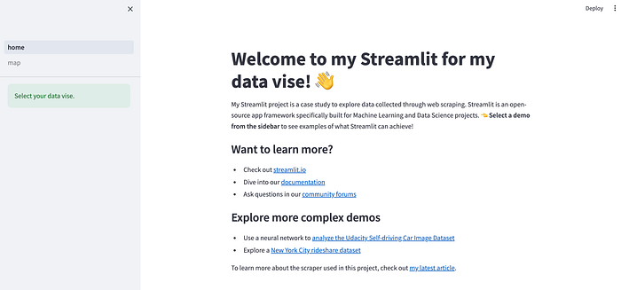
st.write("# Welcome to my Streamlit for my data vise! 👋")
st.write("# Welcome to my Streamlit for my data vise! 👋")
st.sidebar.success("Select your data vise.")
article_url = "https://medium.com/p/09d9a643a27f"
st.markdown(
f"""
My Streamlit project is a case study to explore data collected through web scraping. Streamlit is an open-source app framework specifically built for Machine Learning and Data Science projects. **👈 Select a demo from the sidebar** to see examples of what Streamlit can achieve!
### Want to learn more?
- Check out [streamlit.io](https://streamlit.io)
- Dive into our [documentation](https://docs.streamlit.io)
- Ask questions in our [community forums](https://discuss.streamlit.io)
### Explore more complex demos
- Use a neural network to [analyze the Udacity Self-driving Car Image Dataset](https://github.com/streamlit/demo-self-driving)
- Explore a [New York City rideshare dataset](https://github.com/streamlit/demo-uber-nyc-pickups)
To learn more about the scraper used in this project, check out [my latest article]({article_url}).
"""
)
Run the project with streamlit run home.py
Map
Streamlit has a library of components developed by the community, categorized into 16 different types. Explore these components through this link.
I filtered my search to map components and chose the first one with the most stars, which is available at https://github.com/randyzwitch/streamlit-folium.
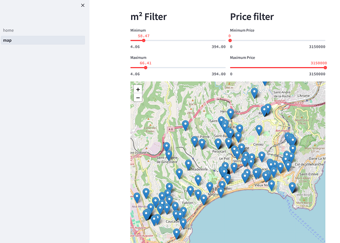
On this page, I aim to display a map with a tooltip for each apartment announcement, along with two filters — one for the area in square meters (m²) and the other for price.
Filter Section
import pandas as pd
import streamlit as st
from streamlit_folium import st_folium
import folium

st.set_page_config(page_title="Mapping Demo", page_icon="🌍")

m = folium.Map(location=[43.7, 7.2], zoom_start=10)
data = pd.read_csv("donnees_immobilieres.csv")

col1, col2 = st.columns(2)

with col1:
    st.header("m² Filter")
    min_area = st.slider("Minimum", min_value=data['floorSize.value'].min(),
                         max_value=data['floorSize.value'].max(), value=data['floorSize.value'].min())
    max_area = st.slider("Maximum", min_value=data['floorSize.value'].min(),
                         max_value=data['floorSize.value'].max(), value=data['floorSize.value'].max())

with col2:
    st.header("Price filter")
    min_price = st.slider("Minimum Price", min_value=data['announce_detail.price'].min(),
                          max_value=data['announce_detail.price'].max(), value=data['announce_detail.price'].min())
    max_price = st.slider("Maximum Price", min_value=data['announce_detail.price'].min(),
                          max_value=data['announce_detail.price'].max(), value=data['announce_detail.price'].max())

filtered_data = data[(data['announce_detail.price'] >= min_price) & (data['announce_detail.price'] <= max_price) &
                     (data['floorSize.value'] >= min_area) & (data['floorSize.value'] <= max_area)]
With m = folium.Map(location=[43.7, 7.2], zoom_start=10), we initialize a Folium map, specifying the location and zoom level when the map opens.
Streamlit manages the layout with col1, col2 = st.columns(2), creating two columns where the code inside is displayed. We then add titles and create two sliders with st.slider to set minimum and maximum values, applying filters to the data frame.
Map Section
for index, row in filtered_data.iterrows():
    long = row['geo.longitude']
    lat = row['geo.latitude']
    price = row['announce_detail.price']
    area = row['floorSize.value']
    address = row['address.addressLocality']
    url = row['url']
    msg_popup = f"<b>Price:</b> {price} €<br><b>Area:</b> {area} m²<br><b>Address:</b> {address}<br><a href='{url}' target='_blank'>Link to Listing</a>"
    msg_tooltip = f"Price: {price} €, Area: {area} m²"

    folium.Marker([lat, long], popup=msg_popup, tooltip=msg_tooltip).add_to(m)

st_data = st_folium(m, width=800, height=600)
The code iterates through each row of the filtered data frame, extracting relevant values to display markers on the map. The map’s size is then set for display.
Now, you can click on the map in the side navigation bar.
Data Exploration
For this section, I implemented the tool pygwalker, which is ideal for handling CSV data. While the code may not be particularly interesting, the tool offers a cool, easy-to-use solution.
Refer to the GitHub documentation of pygwalker for the complete code.
import pandas as pd
import streamlit.components.v1 as components
import streamlit as st
from pygwalker.api.streamlit import init_streamlit_comm, get_streamlit_html

st.set_page_config(
    page_title="Data vise",
    layout="wide"
)

st.title("Data announcement imo")

init_streamlit_comm()


@st.cache_data
def get_df() -> pd.DataFrame:
    return pd.read_csv("donnees_immobilieres.csv")


df = get_df()


@st.cache_resource
def get_pyg_html(df: pd.DataFrame) -> str:
    html = get_streamlit_html(df, spec="./gw0.json", use_kernel_calc=True, debug=False)
    return html


components.html(get_pyg_html(df), width=1300, height=1000, scrolling=True)
In the ‘Data vise’ pages, you’ll find:
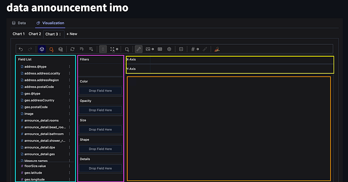
- The turquoise blue represents a list of rows from your CSV, each draggable and selectable.
- Pink signifies filters applied in the graph.
- Yellow represents areas where you can drop rows onto your x or y axis.
- Orange depicts the result.
I’ll share two examples with you:
Classic Stats
For this example, I set the price on the y-axis and the surface area of the apartment on the x-axis. The purple gradient indicates a filter applied to the number of rooms in the apartment.
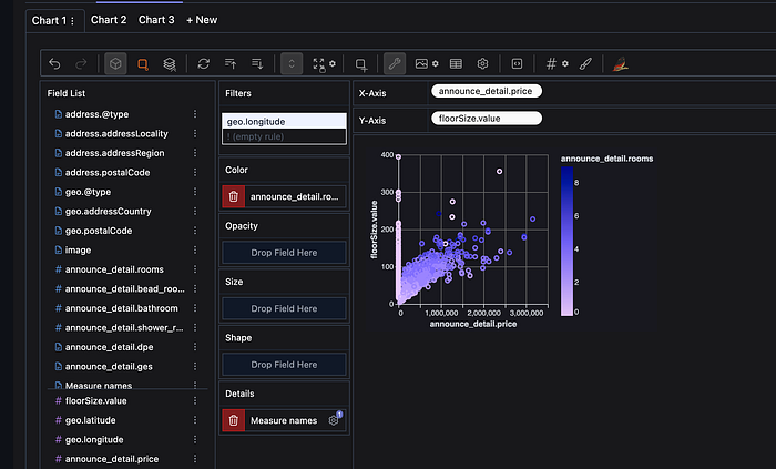
Feel free to explore the Data Vise builder to interact with the data.
Geo Data
The GitHub page of pygwalker presents an example of earthquake visualization. With some research, I successfully applied a similar approach to my data.

Here, I’ve displayed all my data points by longitude and latitude, with the purple gradient indicating the price of the apartment.
Conclusion
This article represents my journey of discovering and exploring Streamlit. Despite my initial lack of knowledge, I found Streamlit to be a valuable addition to my tech stack, enabling rapid prototyping and efficient data exploration. You can find the code for this project on GitHub, where I have uploaded the first 100 rows of my dataset.
In future articles, I plan to delve into creating a similarity search with a vectorial database. If you’d like to stay updated on my future articles, consider subscribing to receive notifications.